
User experience (UX) is no longer just a nice-to-have for recipe platforms—it's essential. According to Progressive Grocer, 89% of consumers use digital recipes.
Poor UX also comes with a cost. A recent report shows that 88% of users are unlikely to return after a bad experience, and 53% of mobile users abandon sites that take longer than 3 seconds to load, according to a UX statistics roundup.
Food content is inherently task-based. Users visit recipe sites with a clear goal: to find, follow, and complete a recipe efficiently. That makes clarity, speed, and intuitive navigation essential. Great UX not only drives longer time on site and higher ad revenue, it also builds brand trust and repeat engagement.
With mobile traffic dominating food content consumption, mobile-first design is no longer optional—it’s essential. On SideChef’s recipe platforms, 80–90% of users access content via mobile devices. More broadly, over 75% of shoppers research e-commerce content on their phones, and 63% of all U.S. search traffic originates from mobile.
Mobile isn’t just where your users start—it’s where they cook, shop, and decide. For example, over 75% of consumers look up recipes on their phones while grocery shopping, and nearly 60% of adults aged 25–34 use their mobile devices as cooking companions.
When designing your recipe platform, start with mobile because that’s where your audience already is. Key design considerations include:
Prioritizing these elements creates a smoother, more intuitive experience—one that meets users where they are, both physically and digitally.
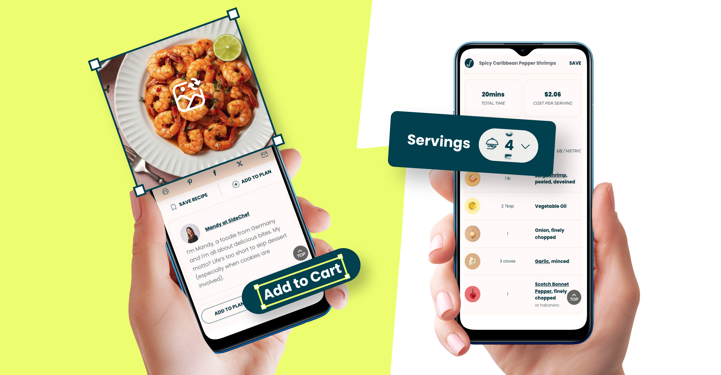
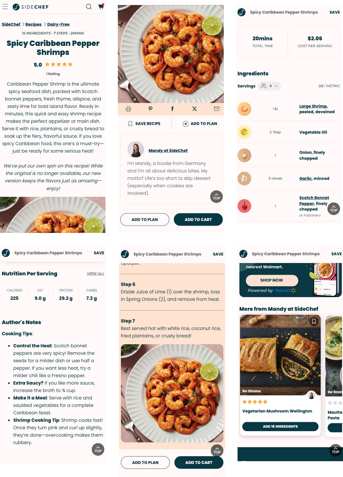
A clean layout makes recipes easier to navigate—especially when ingredients are placed at the top or clearly marked for quick reference. Step-by-step formatting with visual breaks, numbered instructions, and optional timers helps users follow along without friction, whether they’re prepping, cooking, or shopping.
Equally important are core utilities that enhance usability and encourage repeat engagement. Users expect to:
These features should be easy to locate, typically near the top or bottom of the page, but never interfere with the core recipe content.
Visual hierarchy also plays a critical role. Strategic use of typography, spacing, and color contrast ensures content is both accessible and comfortable to consume. For strong examples of well-structured layouts, explore how SideChef’s recipe platform delivers a seamless experience across both mobile and desktop environments.
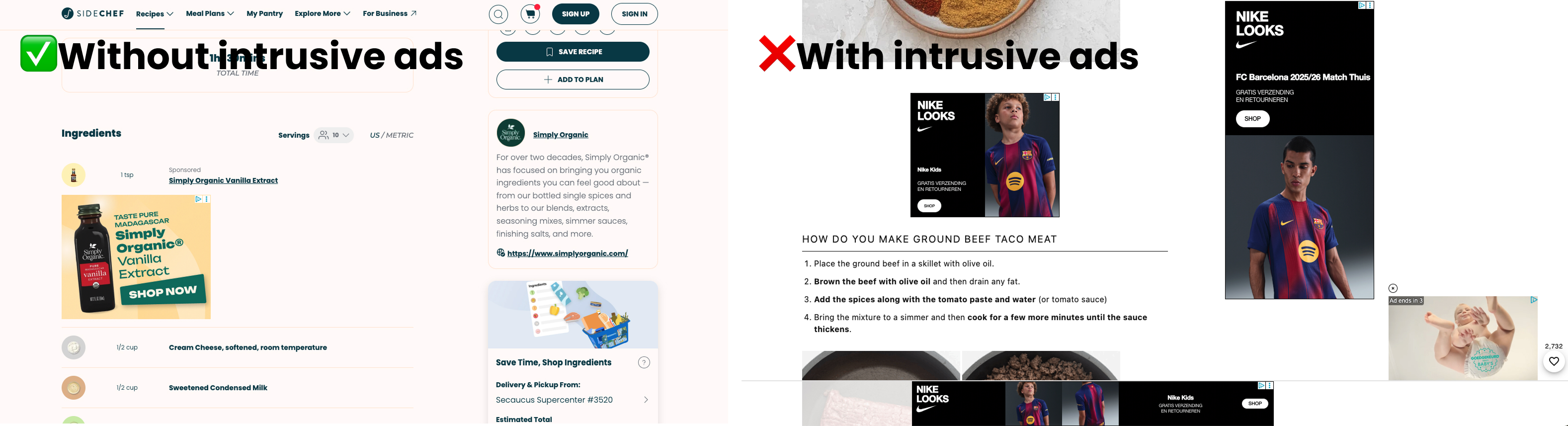
We’ve all been there: clicking into a recipe only to be bombarded with pop-ups, autoplay videos, and 10+ ads before even seeing the actual recipe. This kind of clutter not only frustrates users but also erodes trust and negatively impacts engagement.
While ads are essential for monetization, how and where they appear makes all the difference. Instead of overwhelming users at the top of the page, aim for strategic, low-friction placements, such as:
For a smarter, user-friendly approach, consider contextual formats like SideChef’s In-Recipe Ads. This solution allows specific ingredients to be sponsored, with a discreet, native-style ad shown directly below the sponsored item in the list. This keeps the experience clean while still delivering high-value brand exposure where it makes sense.
Native ads and affiliate links perform best when they feel integrated into the content and useful to the user. Sticky banners, if used, should be minimal, mobile-optimized, and non-intrusive.
Ultimately, building long-term trust and providing a seamless cooking experience should outweigh short-term revenue gains from overly aggressive ad tactics. A well-balanced monetization strategy leads to higher retention, stronger brand loyalty, and better performance over time.
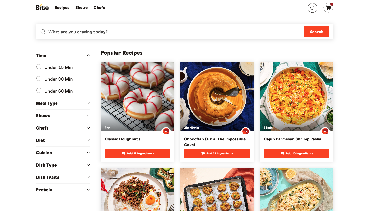
Helping users find what they need quickly is key. Well-structured filters for dietary preferences, cooking times, or skill levels allow for more personalized discovery. Internal linking and related recipe suggestions can extend the journey and reduce bounce rates, while curated content collections or seasonal features keep things fresh.
A strong search feature also makes a difference. Key elements of effective search UX include:
These UX details collectively support session length, repeat visits, and overall satisfaction.
Accessibility shouldn’t be an afterthought. Screen readers must be able to interpret ingredients, instructions, and image descriptions. Font sizes should be adjustable, and color contrast should meet visibility standards to support users with low vision.
Designing for keyboard navigation and optimizing tap targets improves usability not just for users with disabilities, but for everyone. Inclusive UX is good UX—it expands your audience and boosts loyalty.
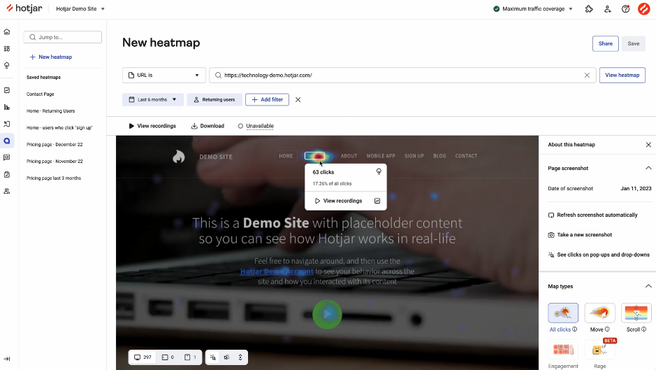
Designing a great user experience is only half the battle—ongoing monitoring is critical to ensure your platform continues to perform as users interact with it in real time. Use these tools and services to stay informed and make data-driven improvements:
Fast, stable pages aren’t just better for users—they’re essential for SEO and retention. Pairing smart design with consistent UX monitoring helps keep your recipe platform both competitive and user-friendly.
Let’s look at how top brands apply UX best practices to real-world platforms—both with and without SideChef support.
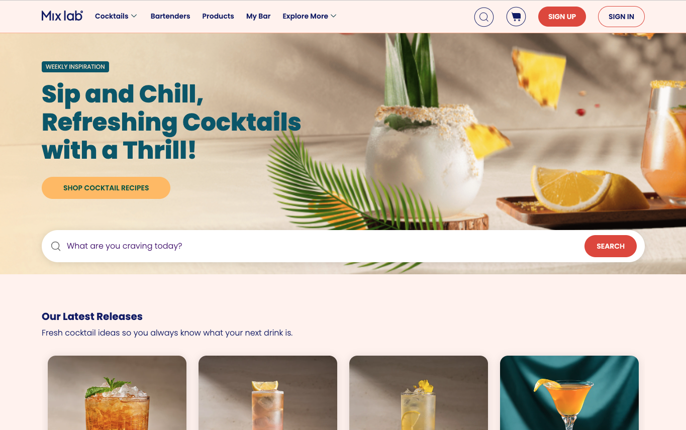
When Bacardi partnered with SideChef to create Mixlab, a premium cocktail discovery and shopping experience, they partnered with SideChef to bring their vision to life. The Mixlab site combines editorial storytelling with shoppable recipes and features:
By blending sleek design with SideChef’s in-recipe commerce tools, Mixlab transforms at-home mixology into an accessible, on-demand experience. It serves as a digital brand destination that drives both engagement and conversion. Learn more in the Mixlab by Bacardi case study.
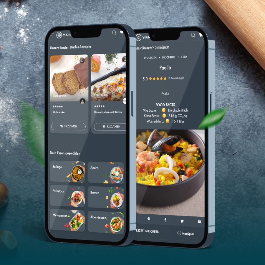
When Swiss appliance brand V-ZUG launched its “V-Kitchen” app and website, they partnered with SideChef to deliver a localized, recipe-rich experience. The platform features:
Thanks to intuitive discovery tools and seamless UX design, V-ZUG positioned V-Kitchen as one of Germany’s leading home-cooking apps. Learn more in the V-Kitchen by V-ZUG case study.
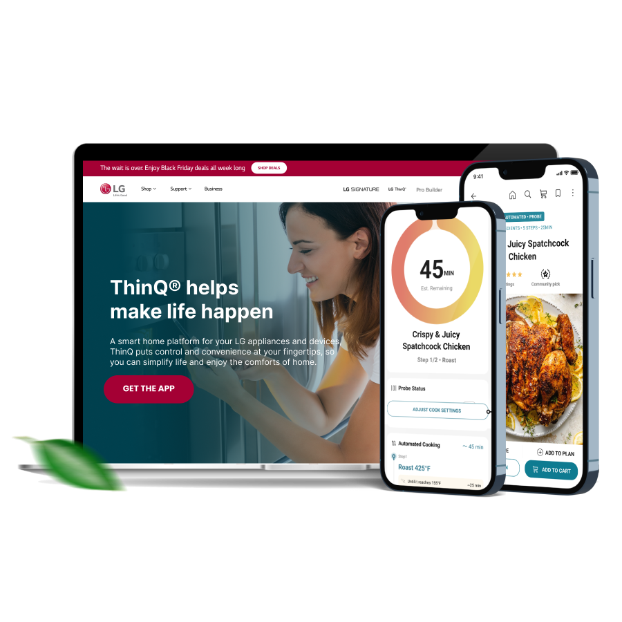
LG integrated a recipe platform powered by SideChef directly into its ThinQ smart home app. Key features include:
LG credits SideChef for delivering a complete and convenient user experience across its network of smart kitchen appliances. Explore how it works in the LG ThinQ Recipe Hub case study.
UX/UI studio Tubik analyzed the Perfect Recipes app to showcase how thoughtful design can streamline cooking and shopping experiences. Highlights include:
This case demonstrates how tight visual hierarchy and functional UX elevate the recipe experience—even outside SideChef’s ecosystem. See design insights in the Perfect Recipes UX case study.
Even the most content-rich platforms can suffer if common UX issues go unaddressed. Here are a few mistakes to avoid:
Avoiding these pitfalls protects the user journey and builds long-term loyalty.
In the crowded world of online cooking content, recipe platforms with great UX win. Intuitive, inclusive, and mobile-first design improves engagement, boosts SEO, and increases monetization potential.
Ready to improve your UX?
Partner with SideChef for a personalized UX audit and strategy tailored to your recipe platform. Discover how SideChef builds scalable recipe platforms by combining intuitive design with powerful backend tools, like a dynamic Recipe CMS and shoppable recipe widgets.
Looking to grow your platform? Explore our turn-key recipe platform solutions—designed to streamline everything from mobile-first UX to integrated product experiences.


Subscribe to the SideChef Business Newsletter

